

The Biggest Movidmo Update Yet: A New Editor Layout
The Biggest Change to Movidmo Since Launch
Movidmo has a new editor. Not a new coat of paint on the old one — a different arrangement of the whole workspace, in both the video editor and the image editor, which share the same design and now share the same layout down to the last panel. It is the largest change since Movidmo launched.
Everything you could do before, you can still do. What changed is where things sit: what you add lives in one row, the settings for whatever you select open in the same column instead of a floating window, and on a phone the whole thing folds into a sheet you can reach with a thumb. Along the way there are two new animations, a rebuilt help center with twenty short videos, and a set of fixes that only turned up by building real projects on a real phone.
One row for everything you add
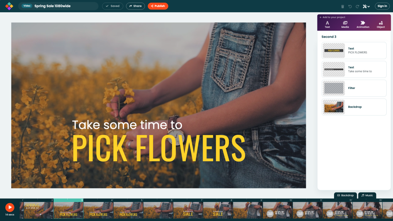
The rail of icons down the left side is gone. In its place is a single Add to your project row above the panel, with four buttons: Text, Media, Animation and Object. Photos and video clips now share one picker with Photos and Videos tabs, so switching between them carries your search across. Shapes and icons share a picker too, under Object.
Those pickers open inside the panel column instead of as a window over your work. You can see the canvas while you choose, which matters most on a laptop screen, where a dialog used to cover the very thing you were trying to change. Both editors work this way: in the image editor the row is the same four buttons, minus the timing that only a video needs.
The panel tells you where you are
In the video editor the panel is headed with the second you are on — Second 4 — and lists everything on screen at that moment, with the backdrop last. In the image editor the same panel is headed INSPECTOR and lists everything on the canvas. Select an object and the panel becomes that object's settings, grouped into sections: its content, its colors, its position and size, and, for video, when it enters and leaves. A back arrow returns you to the list.
Position and size are plain number fields you can tab straight through, and each value applies as you leave the field — so undo steps back through them one at a time rather than swallowing the lot.
A top bar with room for your project's name
The top bar was rebalanced. Your project's name and its size sit on the left, Save, Share and Publish in the middle, and the buttons you use alongside the panel — delete, undo, redo and the Tools menu — on the right. Help moved into the Tools menu, where it leads the list.
Two small things that add up over a long session: the Save button reads Saved when there is nothing left to save, so you can tell at a glance whether your work is safe, and you can click your project's name to rename it without opening a dialog.
Choosing colors
The color menu was rebuilt around a twenty-color palette. The colors already in your project are offered first, colors sampled from your own photos sit below them, and a mixer behind Custom covers anything else. Opacity is a slider in the same menu rather than a separate step, so making something see-through no longer means hunting for a second control.
Two new animations: Drift and Flowers
Drift fills the frame with a slow field of shapes travelling in whatever direction you point them, at four sizes, colors and speeds you choose. The ones meant to be further away are drawn smaller, move slower and sit fainter, so a flat background reads as having depth. It is the quickest way to put something gentle behind your words.
Flowers grows those same four objects on stalks from the edge of the frame. Point it up and they root along the bottom; point it down and they hang from the top. Both pick a fresh arrangement every time you add one, so two copies in the same project never look like twins.
They join more than a hundred animations under Animation, and like all of them they take your colors and your shapes rather than arriving as a fixed clip. Both work in the image editor too, held still on the frame you choose.
The editor on a phone
On a phone the panel is a sheet that rises from the bottom. Tap an object and its settings come up with it, and the canvas slides so the thing you are editing stays in view. The action row keeps Add, Layers, Backdrop and Music within a thumb's reach, with Save and Publish on the right.
Several fixes came from building a complete project on an iPhone rather than in a simulator: adding an object now opens its settings immediately, tapping an object again brings its settings back, and the effect picker no longer leaves a blank tile behind after you pick an effect.
A rebuilt help center
Every article in the help center has been rewritten for the new layout, with fresh screenshots and a short, silent video at the top — twenty of them, covering everything from starting from a template to publishing an MP4. Shapes and icons are now one article, and anything that works differently in the image editor carries a note of its own, so you are never reading video instructions while looking at a still canvas.
Nothing you have made has changed
Every project, template and published video renders exactly as it did before. That was checked frame by frame against the previous build across wide, square and vertical projects before any of this went live: the drawing is identical, and only the workspace around it moved.
Both editors are still free, still export without a watermark, and still run in the browser with nothing to install. If it has been a while, this is a good week to open an old project and look around.